Client
Mölnlycke Healthcare
Modernising the global corporate website
Mölnlycke Health Care redesigned its corporate website to modernise the brand, improve accessibility, and create clearer content structures within a CMS-driven environment. As UX/UI Designer, I helped translate UX strategy into a scalable and accessible interface that balances user needs with editorial flexibility.
Mölnlycke Health Care redesigned its corporate website to modernise the brand, improve accessibility, and create clearer content structures within a CMS-driven environment. As UX/UI Designer, I helped translate UX strategy into a scalable and accessible interface that balances user needs with editorial flexibility.
Mölnlycke Health Care redesigned its corporate website to modernise the brand, improve accessibility, and create clearer content structures within a CMS-driven environment. As UX/UI Designer, I helped translate UX strategy into a scalable and accessible interface that balances user needs with editorial flexibility.

Background and design responsibility
The redesign aimed to enhance user experience while aligning Mölnlycke’s digital presence with its mission to improve patient outcomes worldwide. My role as UX/UI Designer was primarily visual, with a strong responsibility for interaction design, accessibility compliance, and overall usability. Working within an established CMS framework, the challenge was not only to design for end users but also to ensure that content editors could confidently and consistently manage content across different page types and components.
The redesign aimed to enhance user experience while aligning Mölnlycke’s digital presence with its mission to improve patient outcomes worldwide. My role as UX/UI Designer was primarily visual, with a strong responsibility for interaction design, accessibility compliance, and overall usability. Working within an established CMS framework, the challenge was not only to design for end users but also to ensure that content editors could confidently and consistently manage content across different page types and components.
The redesign aimed to enhance user experience while aligning Mölnlycke’s digital presence with its mission to improve patient outcomes worldwide. My role as UX/UI Designer was primarily visual, with a strong responsibility for interaction design, accessibility compliance, and overall usability. Working within an established CMS framework, the challenge was not only to design for end users but also to ensure that content editors could confidently and consistently manage content across different page types and components.


Challenges, approach, and outcomes
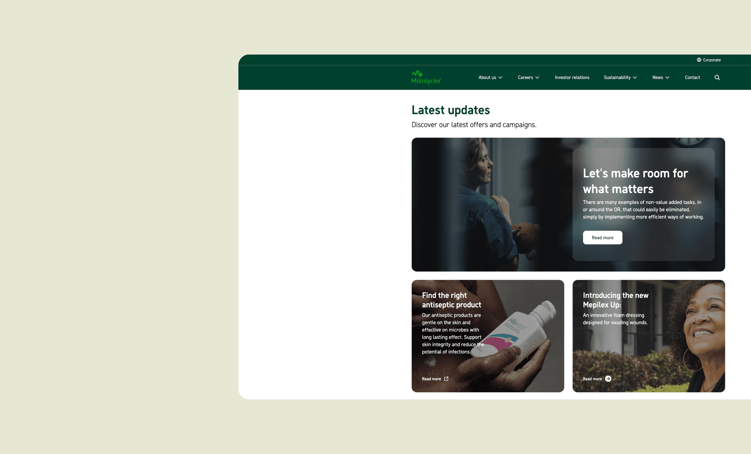
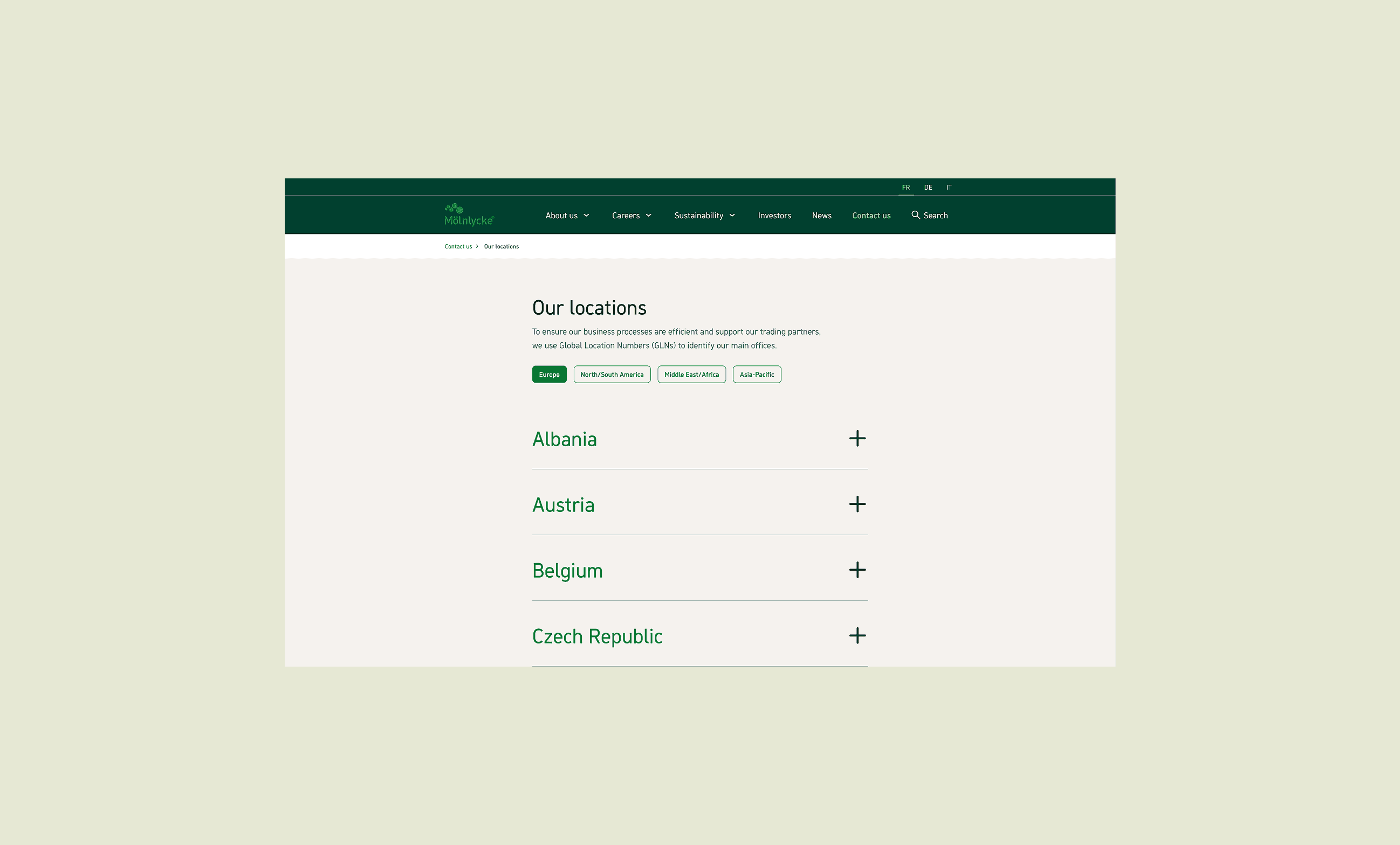
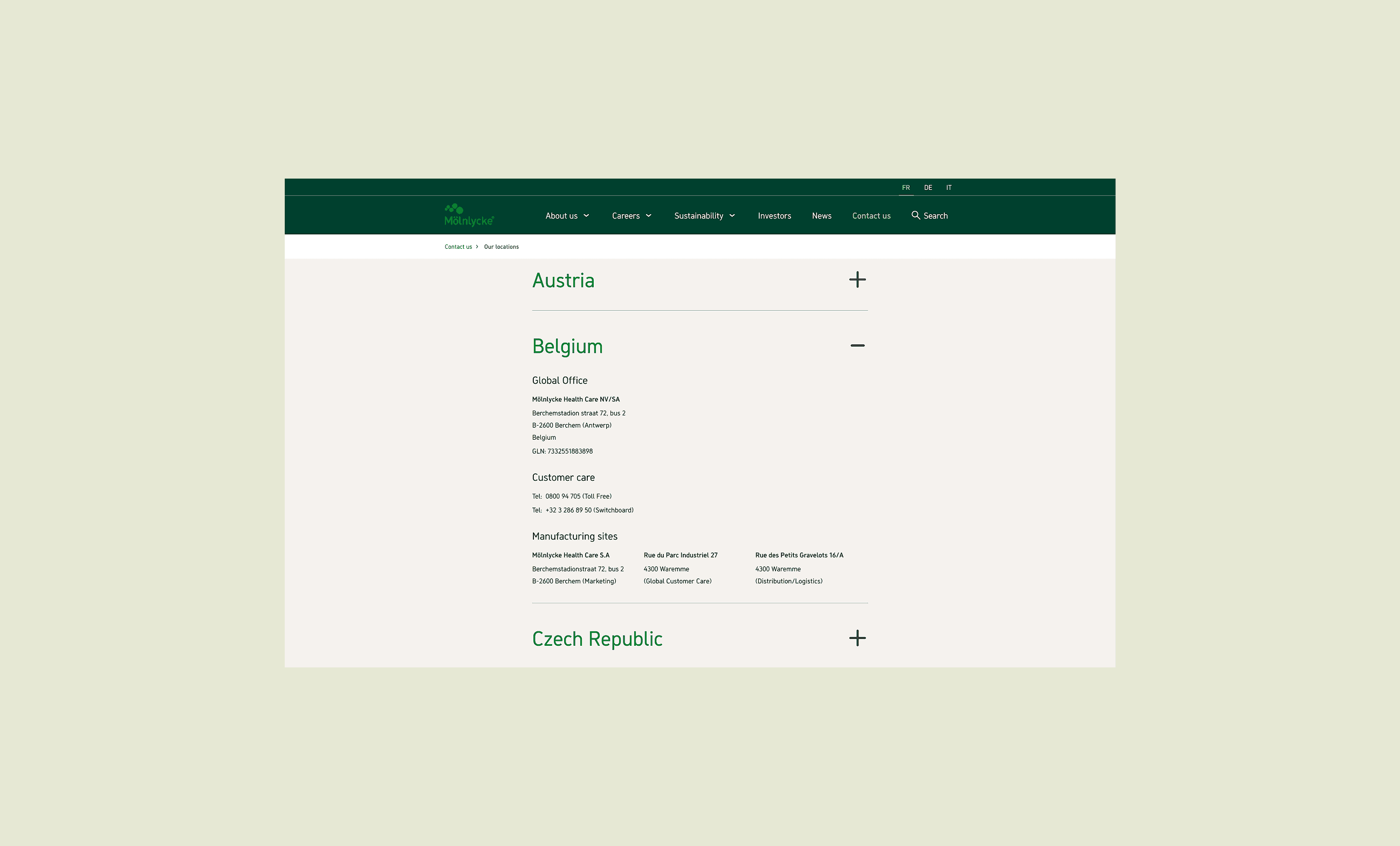
A key challenge was designing flexible components that could function predictably across multiple contexts within a CMS-driven site. Every component needed to account for variations in content length, placement, and editorial usage—balancing design integrity with real-world CMS constraints. I collaborated closely with another Mölnlycke designer who had established a strong UX foundation, including an impact map that guided and validated design decisions throughout the process. This ensured alignment between business goals, user needs, and design outcomes. Several key areas were redesigned to improve clarity and usability: 👉🏼 Contact pages were restructured for better information hierarchy and reduced cognitive load, including separating global locations into a dedicated page. 👉🏼 Articles were transformed from a single rich-text structure into modular, editor-friendly sections, improving readability and content prioritisation. 👉🏼 Listing pages were redesigned to clearly distinguish media types and provide pre-filtered sections, making it easier for users to find relevant content. The final result was a more modern, accessible, and structured website with improved user experience and clearer editorial workflows. In hindsight, deeper collaboration with content editors earlier in the process would have enabled even more refined component planning—benefiting both design scalability and development efficiency.
A key challenge was designing flexible components that could function predictably across multiple contexts within a CMS-driven site. Every component needed to account for variations in content length, placement, and editorial usage—balancing design integrity with real-world CMS constraints. I collaborated closely with another Mölnlycke designer who had established a strong UX foundation, including an impact map that guided and validated design decisions throughout the process. This ensured alignment between business goals, user needs, and design outcomes. Several key areas were redesigned to improve clarity and usability: 👉🏼 Contact pages were restructured for better information hierarchy and reduced cognitive load, including separating global locations into a dedicated page. 👉🏼 Articles were transformed from a single rich-text structure into modular, editor-friendly sections, improving readability and content prioritisation. 👉🏼 Listing pages were redesigned to clearly distinguish media types and provide pre-filtered sections, making it easier for users to find relevant content. The final result was a more modern, accessible, and structured website with improved user experience and clearer editorial workflows. In hindsight, deeper collaboration with content editors earlier in the process would have enabled even more refined component planning—benefiting both design scalability and development efficiency.
A key challenge was designing flexible components that could function predictably across multiple contexts within a CMS-driven site. Every component needed to account for variations in content length, placement, and editorial usage—balancing design integrity with real-world CMS constraints. I collaborated closely with another Mölnlycke designer who had established a strong UX foundation, including an impact map that guided and validated design decisions throughout the process. This ensured alignment between business goals, user needs, and design outcomes. Several key areas were redesigned to improve clarity and usability: 👉🏼 Contact pages were restructured for better information hierarchy and reduced cognitive load, including separating global locations into a dedicated page. 👉🏼 Articles were transformed from a single rich-text structure into modular, editor-friendly sections, improving readability and content prioritisation. 👉🏼 Listing pages were redesigned to clearly distinguish media types and provide pre-filtered sections, making it easier for users to find relevant content. The final result was a more modern, accessible, and structured website with improved user experience and clearer editorial workflows. In hindsight, deeper collaboration with content editors earlier in the process would have enabled even more refined component planning—benefiting both design scalability and development efficiency.
Have a look at my other projects
Have a look at my
other projects

Contact
Let's work together
Contact
Let's work together
Contact