Client
Extrakt
Designing an accessible digital magazine for a public research platform
Extrakt is an online magazine owned by the research council Formas, focused on research and sustainability. What began as a visual refresh evolved into a broader accessibility-driven redesign, requiring both design and structural improvements. As Design Lead, I guided the team in delivering a clearer, more accessible reading experience while balancing tight timelines and public-sector requirements.
Extrakt is an online magazine owned by the research council Formas, focused on research and sustainability. What began as a visual refresh evolved into a broader accessibility-driven redesign, requiring both design and structural improvements. As Design Lead, I guided the team in delivering a clearer, more accessible reading experience while balancing tight timelines and public-sector requirements.
Extrakt is an online magazine owned by the research council Formas, focused on research and sustainability. What began as a visual refresh evolved into a broader accessibility-driven redesign, requiring both design and structural improvements. As Design Lead, I guided the team in delivering a clearer, more accessible reading experience while balancing tight timelines and public-sector requirements.

Background and design leadership
Extrakt targets readers who want to stay informed about current research, particularly within sustainability, while remaining accessible to a broader audience. The initial brief focused on updating colors and typography, but early accessibility testing revealed that the existing visual identity did not meet contrast and WCAG requirements—necessitating a wider redesign scope. As Design Lead, I was responsible for setting direction, ensuring accessibility compliance, and aligning design decisions with both editorial goals and technical constraints.
Extrakt targets readers who want to stay informed about current research, particularly within sustainability, while remaining accessible to a broader audience. The initial brief focused on updating colors and typography, but early accessibility testing revealed that the existing visual identity did not meet contrast and WCAG requirements—necessitating a wider redesign scope. As Design Lead, I was responsible for setting direction, ensuring accessibility compliance, and aligning design decisions with both editorial goals and technical constraints.
Extrakt targets readers who want to stay informed about current research, particularly within sustainability, while remaining accessible to a broader audience. The initial brief focused on updating colors and typography, but early accessibility testing revealed that the existing visual identity did not meet contrast and WCAG requirements—necessitating a wider redesign scope. As Design Lead, I was responsible for setting direction, ensuring accessibility compliance, and aligning design decisions with both editorial goals and technical constraints.


Accessibility-first – design, process, and outcome
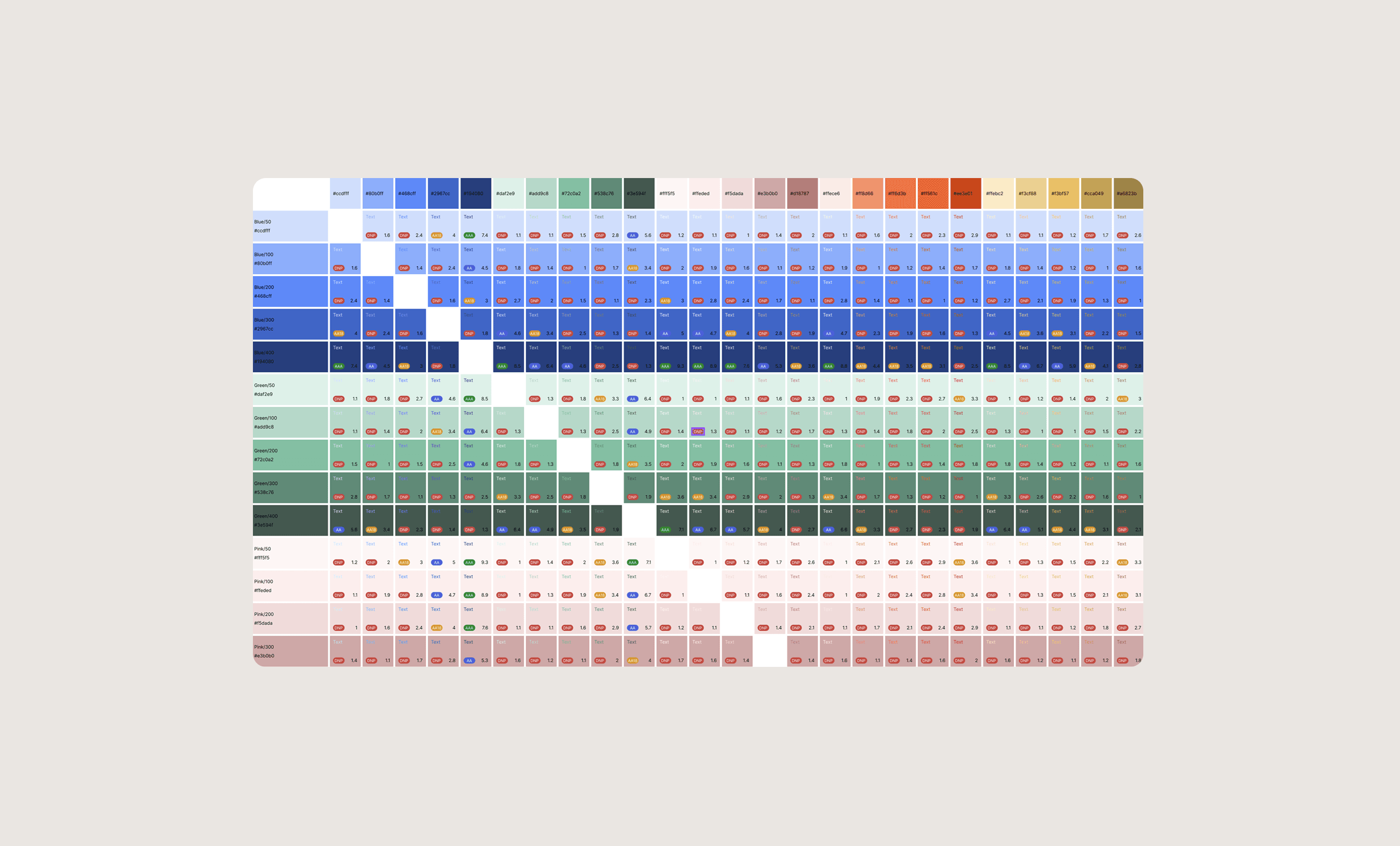
Accessibility quickly became a central focus of the project. After evaluating the new visual identity, it was clear that color contrast and readability needed to be reworked. Through close collaboration with the client, we aligned on prioritising accessibility improvements across the site despite limited time and resources. To build trust and clarity, I designed a clean and compact grid system that avoided the clutter often seen in digital magazines, while still giving content room to breathe. Analytics showed that users frequently navigated between multiple subjects in a single session, which informed the design of an easily accessible subject selector placed at the end of each page. Subject pages were designed with a brief introduction followed by an infinite article list; while pagination would have been preferable, time constraints required pragmatic trade-offs. Search results were treated as a distinct experience, prioritising relevance over visual consistency with other listing pages to help users find information quickly. Article layouts were inspired by Swiss typography, with a restrained, minimal approach that emphasised readability while using subtle motion to guide the reader through longer texts. Given the expanded scope and fixed timeline, prioritisation was critical. I established a shared project scope with clear task categorisation, allowing the team to stay focused while remaining flexible. This approach encouraged early developer involvement and continuous dialogue throughout the process. The project resulted in a website aligned with Formas’ updated visual profile, offering improved usability and accessibility. We were transparent that further technical restructuring would be required to fully meet WCAG standards, positioning the delivery as a solid step in an ongoing improvement process rather than a final endpoint.
Accessibility quickly became a central focus of the project. After evaluating the new visual identity, it was clear that color contrast and readability needed to be reworked. Through close collaboration with the client, we aligned on prioritising accessibility improvements across the site despite limited time and resources. To build trust and clarity, I designed a clean and compact grid system that avoided the clutter often seen in digital magazines, while still giving content room to breathe. Analytics showed that users frequently navigated between multiple subjects in a single session, which informed the design of an easily accessible subject selector placed at the end of each page. Subject pages were designed with a brief introduction followed by an infinite article list; while pagination would have been preferable, time constraints required pragmatic trade-offs. Search results were treated as a distinct experience, prioritising relevance over visual consistency with other listing pages to help users find information quickly. Article layouts were inspired by Swiss typography, with a restrained, minimal approach that emphasised readability while using subtle motion to guide the reader through longer texts. Given the expanded scope and fixed timeline, prioritisation was critical. I established a shared project scope with clear task categorisation, allowing the team to stay focused while remaining flexible. This approach encouraged early developer involvement and continuous dialogue throughout the process. The project resulted in a website aligned with Formas’ updated visual profile, offering improved usability and accessibility. We were transparent that further technical restructuring would be required to fully meet WCAG standards, positioning the delivery as a solid step in an ongoing improvement process rather than a final endpoint.
Accessibility quickly became a central focus of the project. After evaluating the new visual identity, it was clear that color contrast and readability needed to be reworked. Through close collaboration with the client, we aligned on prioritising accessibility improvements across the site despite limited time and resources. To build trust and clarity, I designed a clean and compact grid system that avoided the clutter often seen in digital magazines, while still giving content room to breathe. Analytics showed that users frequently navigated between multiple subjects in a single session, which informed the design of an easily accessible subject selector placed at the end of each page. Subject pages were designed with a brief introduction followed by an infinite article list; while pagination would have been preferable, time constraints required pragmatic trade-offs. Search results were treated as a distinct experience, prioritising relevance over visual consistency with other listing pages to help users find information quickly. Article layouts were inspired by Swiss typography, with a restrained, minimal approach that emphasised readability while using subtle motion to guide the reader through longer texts. Given the expanded scope and fixed timeline, prioritisation was critical. I established a shared project scope with clear task categorisation, allowing the team to stay focused while remaining flexible. This approach encouraged early developer involvement and continuous dialogue throughout the process. The project resulted in a website aligned with Formas’ updated visual profile, offering improved usability and accessibility. We were transparent that further technical restructuring would be required to fully meet WCAG standards, positioning the delivery as a solid step in an ongoing improvement process rather than a final endpoint.
Have a look at my other projects
Have a look at my
other projects

Contact
Let's work together
Contact
Let's work together
Contact